Plot Panel: Visualizing Data Trends
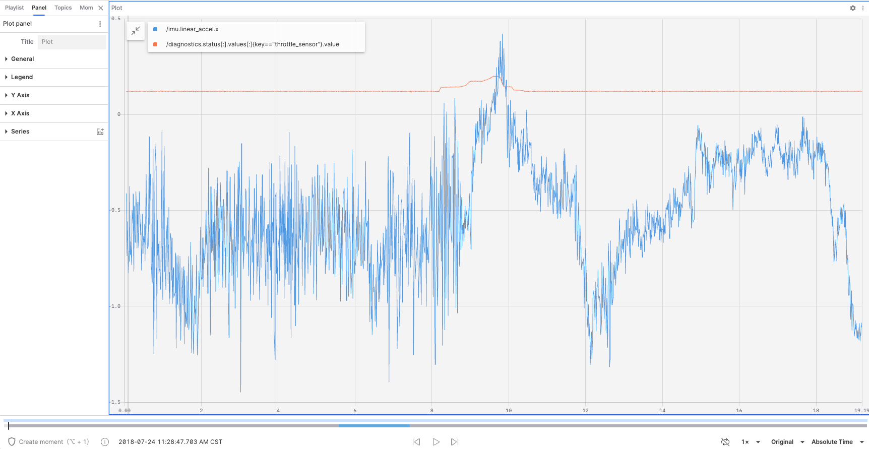
The "Plot Panel" is a tool used for plotting and displaying data trends over time or other variables. It allows users to configure multiple data series and visualize these trends in a clear and intuitive chart format.

Properties in the Plot Panel
Data Series
-
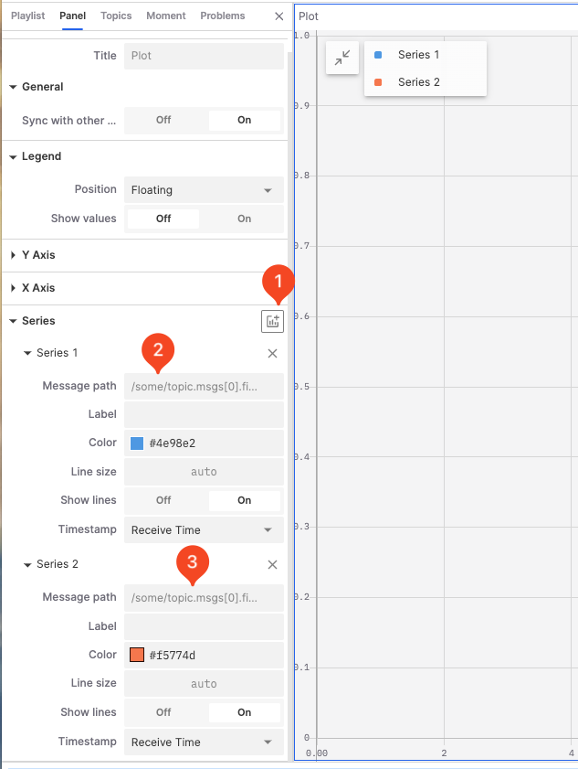
Add a new data series

-
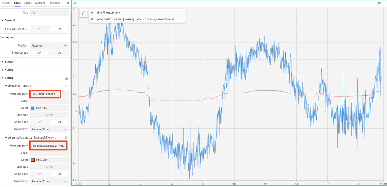
Enter the message address

-
Configure the data series
- Label: Set the label text for the data series.
- Color: Set the color for the data series.
- Line Size: Set the line width for the data series.
- Show Lines: Enable or disable the display of the data series label.
- Timestamp: Used to mark the time position of data points, ensuring that data is correctly plotted in the chart in chronological order.
- Receive Time: Use the receive time as the timestamp to show the actual time the data arrived in the system.
- Header Timestamp: Use the header timestamp to show the actual time the data occurred on the source device.
General
- Sync with other charts: In a multi-chart view, enabling this option synchronizes the zoom and pan of multiple charts for easier comparison and analysis of data.
Legend

- Position: Set the position of the legend; options include floating, left, top, and hidden.
- Show Values: Enable this to show data point values directly in the legend.
Y Axis

- Show Labels: Control whether to display scale labels on the Y axis.
- Min and Max Values: Set the start and end values of the Y axis.
X Axis

- Values: Choose the values displayed on the X axis, options include timestamp, index, address (current), and address (cumulative).
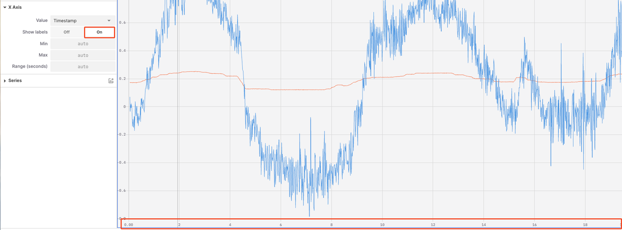
- Show Labels: Control whether to display scale labels on the X axis.
- Max and Min Values: Set the start and end values of the X axis.
- Range (seconds): Control the length of the time span displayed on the X axis.